<14:30 ~ 17:30>
CSS의 하나의 클래스가 여러개의 클래스 요소를 갖는 것은 그럴 수 있는 것이다!
더보기
<!DOCTYPE html>
<html lang="en">
<head>
<meta charset="UTF-8">
<meta name="viewport" content="width=device-width, initial-scale=1.0">
<title>CSS 선택자 연습 페이지</title>
<link rel="stylesheet" href="styles.css">
</head>
<body>
<header>
<h1>CSS 선택자 연습</h1>
<p class="subtitle">다양한 선택자를 실습해 보세요!</p>
</header>
<main>
<section id="basic-selectors">
<h2>1. 기본 선택자</h2>
<p>태그 선택자, 클래스 선택자, ID 선택자를 연습해 보세요.</p>
<div id="example-box">
<p class="highlight">이 문장은 클래스 선택자를 사용합니다.</p>
<p>이 문장은 태그 선택자를 사용합니다.</p>
<p id="special">이 문장은 ID 선택자를 사용합니다.</p>
</div>
</section>
<section id="nested-selectors">
<h2>2. 중첩된 선택자</h2>
<div class="parent">
<p>부모 요소 내부</p>
<div class="child">
<p>자식 요소 1</p>
<p>자식 요소 2</p>
</div>
</div>
</section>
<section id="pseudo-classes">
<h2>3. 가상 클래스 선택자</h2>
<ul>
<li>첫 번째 항목</li>
<li>두 번째 항목</li>
<li>세 번째 항목</li>
</ul>
<button>호버 또는 포커스를 테스트하세요</button>
</section>
<section id="advanced-selectors">
<h2>4. 복잡한 선택자</h2>
<p><span>이 문장에는 <strong>중첩된</strong> 요소가 있습니다.</span></p>
<p class="highlight">CSS로 이 텍스트를 스타일링해 보세요!</p>
</section>
</main>
<footer>
<p>© 2024 CSS 선택자 연습 페이지</p>
</footer>
</body>
</html>
웹브라우저의 창을 기준으로 고정되게 배치하는 것 : fixed
웹브라우저의 문서를 기준으로 배치하는 것 : absolute
웹브라우저의 문서 내에서 내가 원하는 상대좌표에 배치하는 것 : relative

더보기
<!DOCTYPE html>
<html lang="en">
<head>
	<meta charset="UTF-8">
	<title>Step07_Position2.html</title>
	<style>
		.box{
			width: 100px;
			height: 100px;
			border: 1px solid red;
		}
		.spacer{
			height: 500px;
			background-color: #999;
		}
		#one{
			position: relative;
			/* 위에서 떨어진 거리 (y좌표) */
			top: 150px;
			/* 왼쪽에서 떨어진 거리 (x좌표)*/
			left: 150px;
		}
		/* absolute 는 특정 요소를 기준으로 절대 좌표에 배치 하고자 할때 사용한다. (특정 요소는 부모 요소인데 부모요소의 position 속성이 명시적으로 지정 되어 있어야 부모 요소를 기준으로 절대 좌표에 배치할 수 있다. */
		#two{
			/* 부모 요소가 position 속성이 없으면 body 기준으로 절대 좌표에 배치 */
			position: absolute;
			top: 100px;
			left: 100px;
		}
		/* fixed 는 window 기준으로 절대 좌표에 배치 할때 사용한다.
		따라서 스크롤바를 움직여도 window 기준으로 항상 같은 위치에 존재한다. */
		#three{
			position: fixed; /*이 행이 아예 없으면 탑 레프트가 있어도 소용 없음*/
			top: 100px;
			left: 200px;
		}
	</style>
</head>
<body>
<div class="box">static</div>
<div class="box" id="one">relative</div>
<div class="spacer"></div>
<div class="box" id="two">absolute</div>
<div class="box">너는 어디?</div>
<div class="box" id="three">fixed</div>
</body>
</html>

더보기


<!DOCTYPE html>
<html lang="en">
<head>
<meta charset="UTF-8">
<title>Step07_Example.html</title>
<style>
.wrapper{
position: relative;
width: 500px;
height: 500px;
margin: 0 auto;
border: 1px solid red
}
.box{
position: absolute;
width: 50px;
height: 50px;
background-color: yellow;
}
#one{
top: 100px;
left: 100px;
}
#two{
top: 100px;
right: 100px;
}
#three{
bottom: 100px;
left: 100px;
}
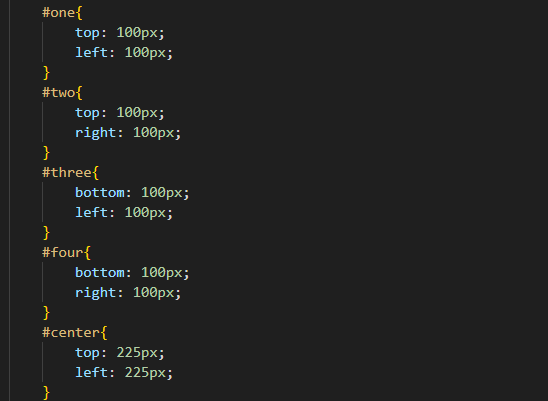
#four{
bottom: 100px;
right: 100px;
}
#center{
top: 225px;
left: 225px;
}
/* .wrapper div 전체 덮기 */
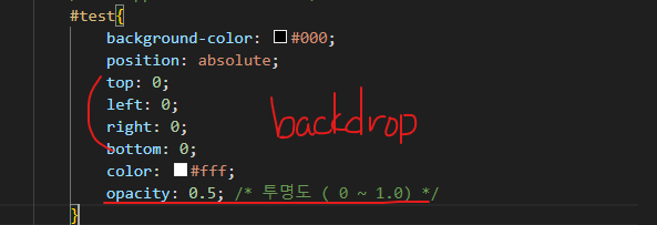
#test{
background-color: #000;
position: absolute;
top: 0;
left: 0;
right: 0;
bottom: 0;
color: #fff;
opacity: 0.5; /* 투명도 ( 0 ~ 1.0) */
display: none;
}
</style>
</head>
<body>
<h3>특정 요소 안에서 원하는 위치에 배치</h3>
<div class="wrapper">
<div class="box" id="one">one</div>
<div class="box" id="two">two</div>
<div class="box" id="three">three</div>
<div class="box" id="four">four</div>
<div class="box" id="center">center</div>
<div id="test">test</div>
</div>
<button id="backdropbtn">backdrop</button>
<script>
document.querySelector("#backdropbtn").addEventListener("click", function(){
//javascript로 조작하는 css는 inline css를 조작하는 것.
//따라서 위에 style 요소에 작성한 css를 재정의 할 수가 있다
document.querySelector("#test").style.display = "block";
})
document.querySelector("#test").addEventListener("click", function(){
document.querySelector("#test").style.display="none";
})
</script>
</body>
</html>
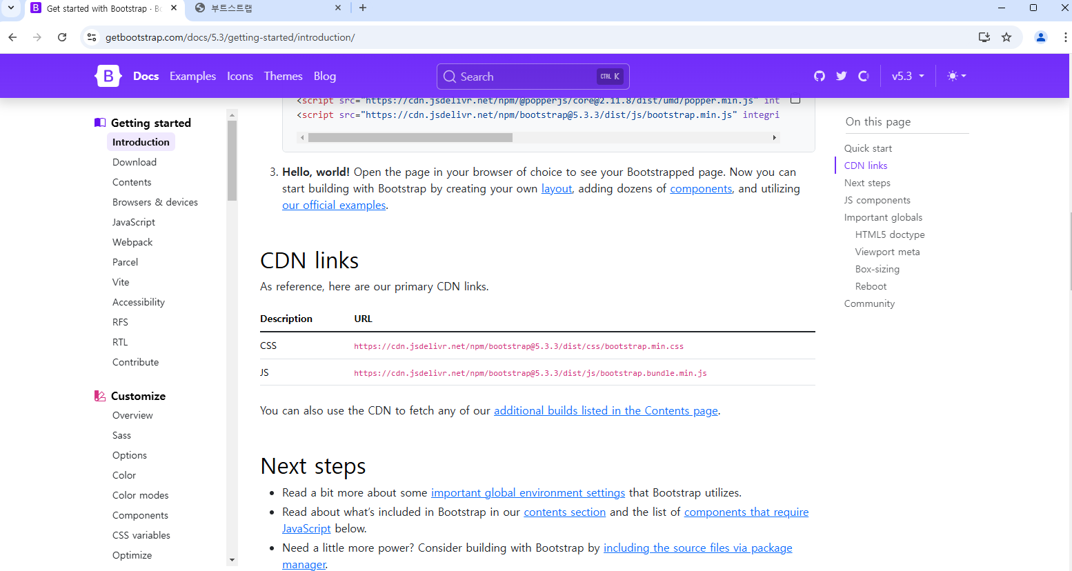
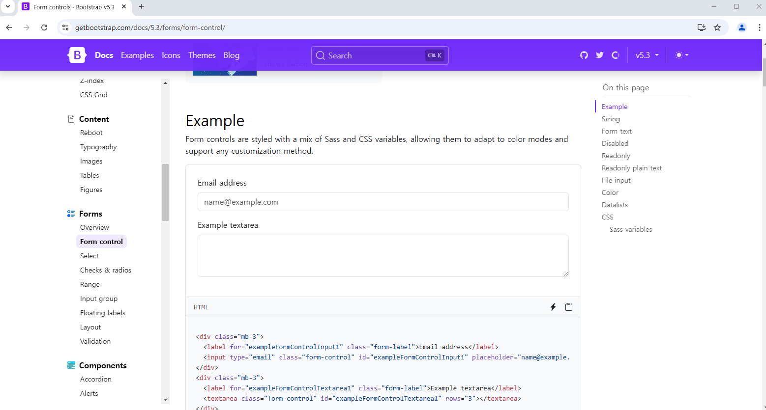
이미 만들어진 CSS들과 자바스크립트가 있는 https://getbootstrap.com/
Bootstrap
Powerful, extensible, and feature-packed frontend toolkit. Build and customize with Sass, utilize prebuilt grid system and components, and bring projects to life with powerful JavaScript plugins.
getbootstrap.com
더보기
<!DOCTYPE html>
<html lang="en">
<head>
    <meta charset="UTF-8">
    <meta name="viewport" content="width=device-width, initial-scale=1.0">
    <title>부트스트랩</title>
    <link rel = "stylesheet" href="	https://cdn.jsdelivr.net/npm/bootstrap@5.3.3/dist/css/bootstrap.min.css">
</head>
<body>
   <div class="container">
        <h1>hello bootstrap!</h1>
        <button class="btn">버튼</button>
        <a href="#">링크</a>
        <!--링크에도 버튼 클래스 속성을 부여하면 링크 역할을 하는데 버튼 모양인게 나타남
        -->
    </div>
    <script src="https://cdn.jsdelivr.net/npm/bootstrap@5.3.3/dist/js/bootstrap.bundle.min.js" integrity="sha384-YvpcrYf0tY3lHB60NNkmXc5s9fDVZLESaAA55NDzOxhy9GkcIdslK1eN7N6jIeHz" crossorigin="anonymous"></script>

</body>
</html>
자바스크립트는 없지만 CSS는 제공하는 사이트
Tailwind CSS - Rapidly build modern websites without ever leaving your HTML.
Tailwind CSS is a utility-first CSS framework for rapidly building modern websites without ever leaving your HTML.
tailwindcss.com
'자바풀스택 과정 > 자바 풀 스택 : 수업내용정리' 카테고리의 다른 글
| 자바 풀 스택 12/10 오후 기록 014-2 (0) | 2024.12.10 |
|---|---|
| 자바 풀 스택 12/10 오전 기록 014-1 (0) | 2024.12.10 |
| 자바 풀 스택 12/9 오전 기록 013-1 (1) | 2024.12.09 |
| 자바 풀 스택 12/6 오후 기록 012-2 (1) | 2024.12.06 |
| 자바 풀 스택 12/6 오전 기록 012-1 (2) | 2024.12.06 |